BRIEF
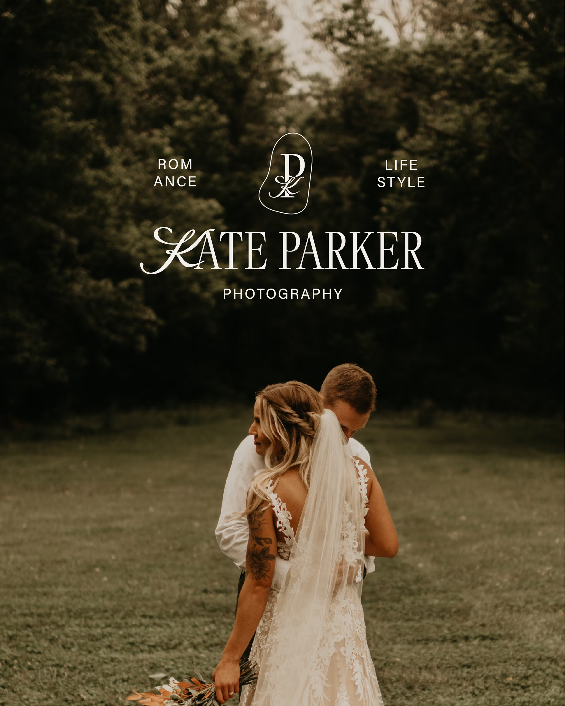
Kate Parker is a traveling photographer specializing in lifestyle and wedding portraits. She needed a brand refresh to reflect her signature dark-toned and timeless style of capturing special moments.
SERVICES
Logo in a day package
SOLUTION
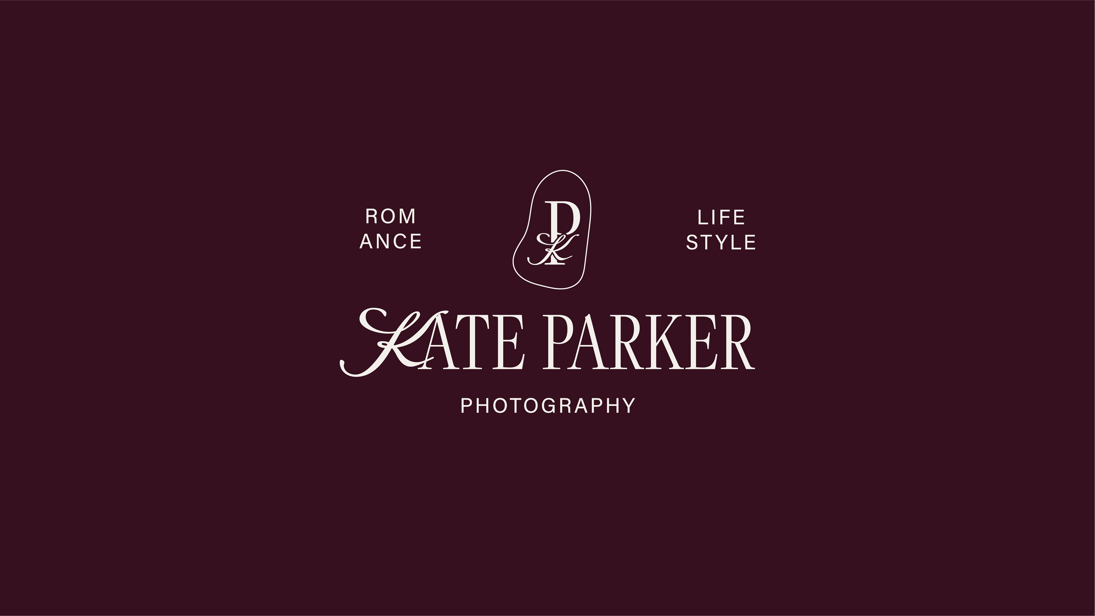
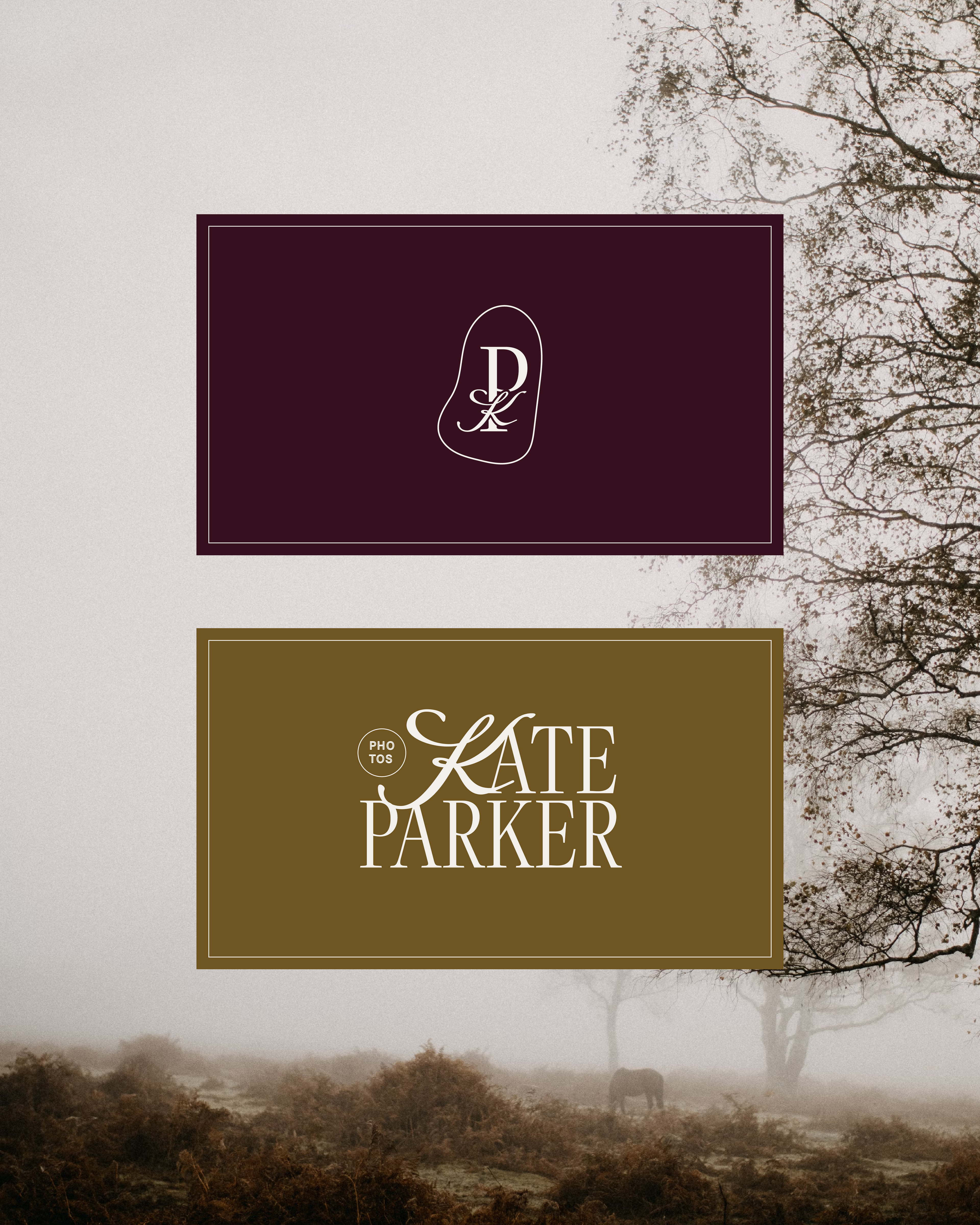
Intentionally designed with a moody colour palette, representing the photographer's personal style of exuding nostalgia and romance in her stills. Opted for a classic serif font while adding a touch of playfulness with script to represent the adventures of Kate's life as a traveling photographer. Designed the ‘P’ in the logomark to be pronounced keeping her profession as a photographer the main focus and used the ‘K’ as a bow to tie everything together for a timeless elegant and feminine presence.