BRIEF
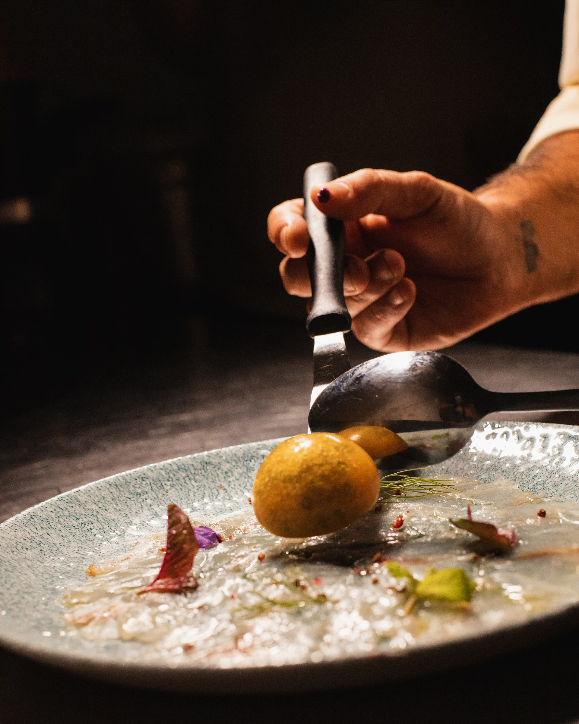
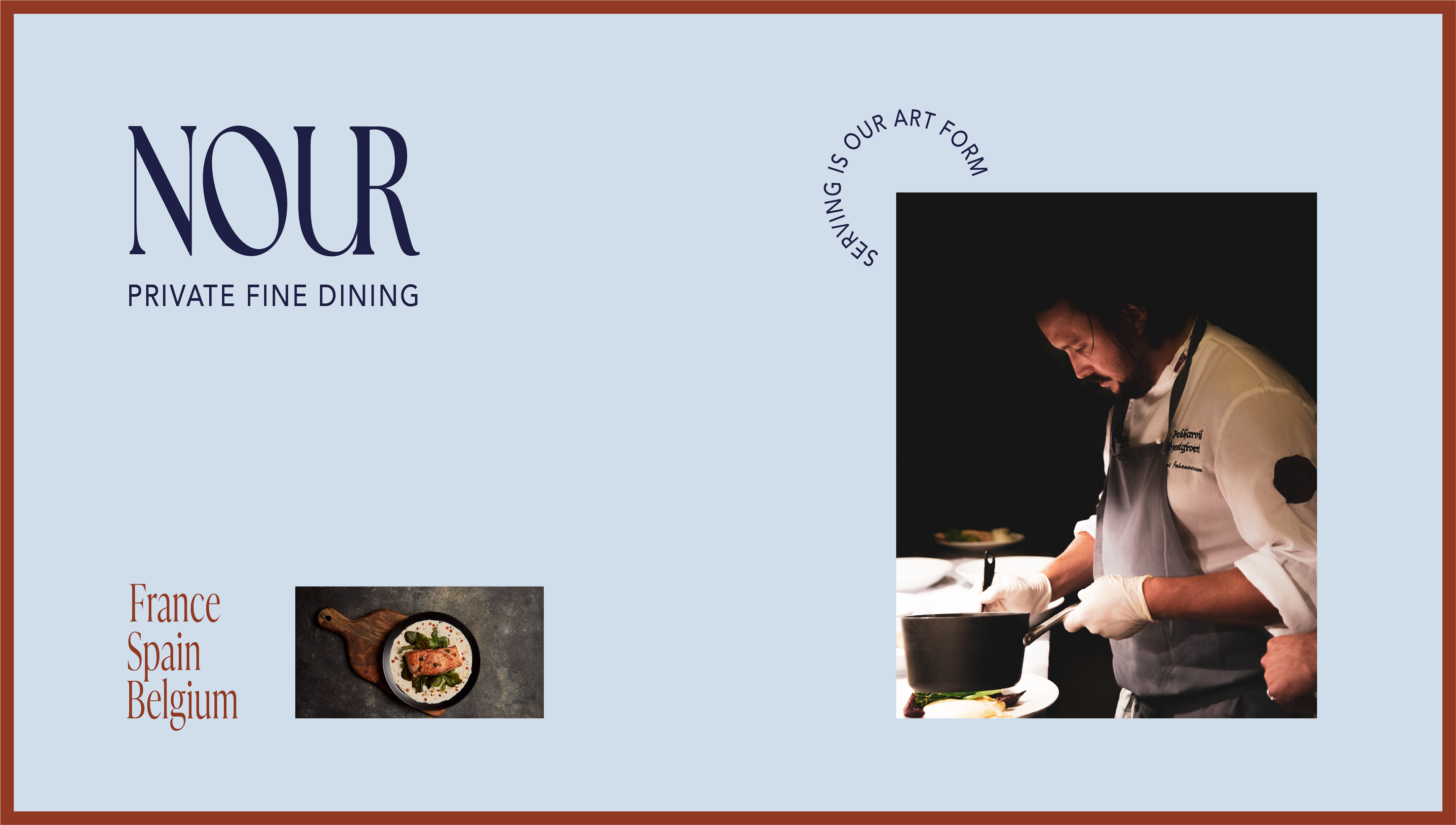
Nour is an exquisite, private fine dining service with multiple locations and offerings in France, Spain and Belgium. The brand's name is derived from 'nourriture' meaning food in French, and needed a look that represented classy dining without using neutral colors as their name also means 'light/radiance' in Arabic.
SERVICE
Bespoke: Wordmark logo, colour palette, visual direction
SOLUTION
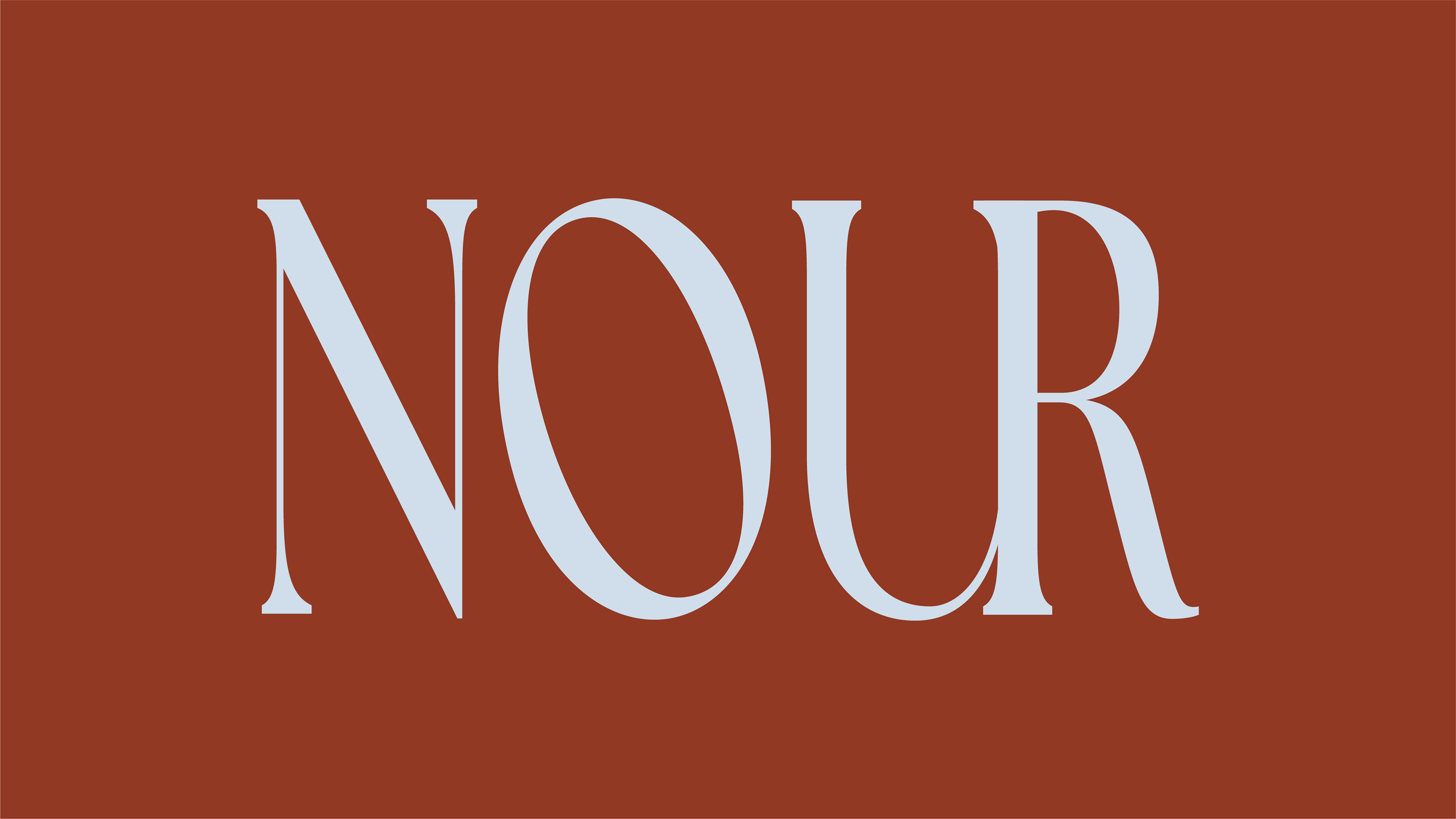
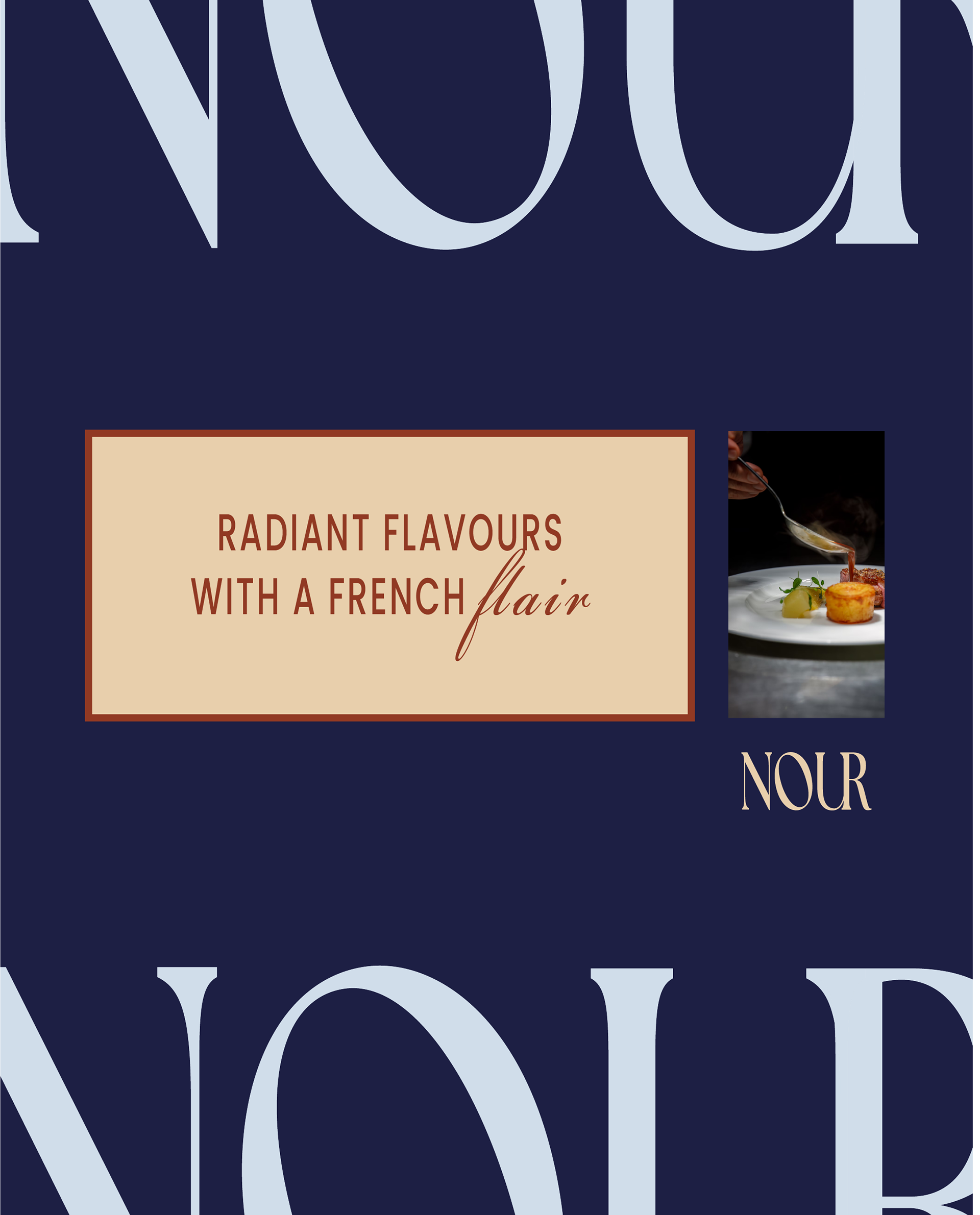
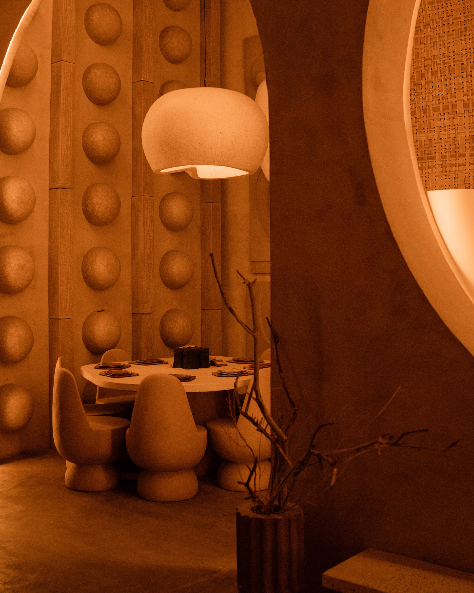
Nour is known for their exceptional ambient lighting in their dining experiences and their bright flavours in food. In alignment with this, I chose burnt orange as a primary colour to convey the message of warmth and radiance clients rave about in their private gatherings, and navy and light blue to represent the classic feel of French fashion and interiors. Lastly, I chose a sleek typeface to depict the luxurious experience they offer.